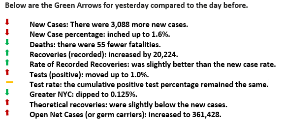
Yesterday was a FOUR Green Arrow Day.
Isolate Geographies and Potential Contamination
Good Morning,
Yesterday was a FOUR Green Arrow day as new cases outpaced recoveries and accordingly had its impact throughout the statistics. Of note, it was the fifteenth consecutive day; there were fewer than 1,000 fatalities. The rest of the specifics are listed below.
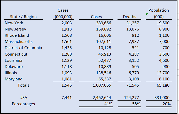
The second leg of our recommended strategy is to isolate geographies and places of potential contamination. The chart beneath shows the top ten states/regions of COVID based on the rate per million. The top ten account for 20% of our total population, yet 41% of the cases and almost 60% of the fatalities.
Notice that eight of the ten are the Boston to DC corridor. This metroplex relies on public transportation much more significantly than the rest of the country, except for Chicago. That makes nine out of ten, dependent on trains, subways, and busses every day. In NYC, more than 5 million use one of these forms each workday.
A recent study, “MIT Discovers NYC Mass Transit Spreads Disease,” supports our view that a closed vehicle with little airflow with as many as 100 people per car, unfortunately, is an ideal fecund for the virus. These cars are used over and over again without assured cleaning or sanitation. Since the average commute is 43 minutes, there is more than enough time to COVID to find another host. We’d also bet a few Ice Cream Sundays that the demographics that use public transportation would be very close to the percentage of cases in that region.
Our point is that specific geographies, the modes of transportation, and or closed pack quarters are the most relevant factors in the spread of COVID.

Based on CNN data per state as of June 24, 2020. The rates are per 1 million.
These are the only regions in which there is greater than a 1% infection rate.


