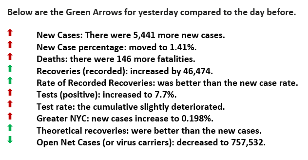
Yesterday was a FOUR Green Arrow Day.
Guidelines by Category
Yesterday was a FOUR Green Arrow Day. Below are the particulars for the day.
Currently, policymakers are using strategies that imply the virus stops at state or county lines and that everyone is at a universal risk. It would be more insightful to treat COVID more as a weather pattern. Weather effects regions, and likewise, so does the virus. For example, metroplexes have similar infection rates even though there are multiple states involved. If one state exercises one approach and the neighboring state does another, the results would not be reflective of either one, especially if they share a subway, train, or bus line.
Similarly, the guidelines established by governmental officials imply a universal risk necessitating the same regulations for everyone. But not everyone has the same risk profile, and thus those guidelines are frustrating without more in-depth reasoning. Rather than a “one-size-shoe-fits all” method, why not customize them based on risk profiles.
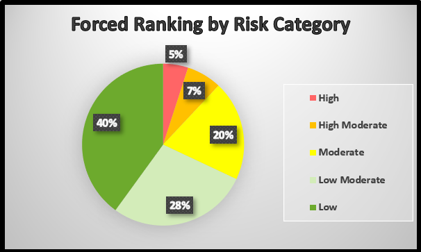
Last week we showed using prescription drug information and a forced ranking system we could group people as to their vulnerability of having severe effects of COVID (see chart below). Let’s take that one step further and, based on the assigned risk categories, customize the guidelines accordingly. Those with multiple underlying conditions have more at stake, while others do not. Protecting those most vulnerable will lessen the number of fatalities and those that need intensive care.
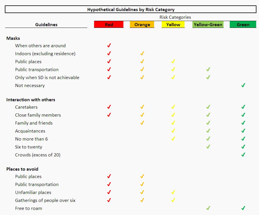
Using the risk categories, we developed hypothetical guidelines (see chart below). Notice how when how restrictive the red and orange groups are compared to the yellow-green and green ones. This is a more practical appeal and would be more acceptable to the public-at-large. More and more are becoming frustrated, rebelling, and not following general guidelines. Yes, it requires “self-governance” and responsibility. The benefit is that more Americans can go to work, get on with their daily lives, and support a more logically tuned system. We would add a note of caution that just because a person happens to be in a favorable category, they need to be aware of loved ones that are vulnerable, especially living in the same household.
Oh, there is one other benefit of classifying individuals in specific risk categories, as one astute young lady pointed out to me, “it would be a good way to determine which people should get the vaccine first.” Good point.
Guidelines by Category
These guidelines are based on the “Forced Ranking Categories” listed below. The are of course hypothetical and would need to be tuned and modified by those with more epidemiology expertise than we have at COVID in 60.
Forced Ranking (FR)
This pie chart forces one to classify health conditions in risk categories. We know that 3.6% of those that contracted the virus died and their specific health conditions (i.e., weight, diabetic status, et cetera). What were those particular conditions? A process would ensue until the specific health traits would equal 5% of the US population, and then be identified as “high risk.” Then the next level (moderate risk), the one after that and so on. Public reporting should match these risk groups. For example, there were 100 deaths yesterday, and all but one were in the high-risk or red category.


Please click here for references. If you have not already registered, register now to receive the latest updates on the unprecedented COVID-19 pandemic.


