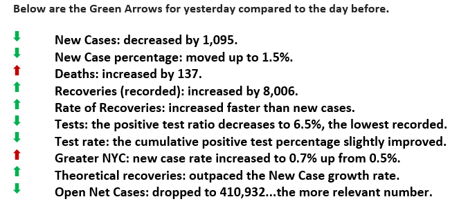
Yesterday was a seven green arrow day.
Again…Relevant Number?
Good Morning:
In yesterday’s Newsletter, we discussed the reporting of data that has accumulated, such as in the 1.4 million cases in the US. We then compared that to those that still require care, about 400,000, which might be a more important statistic to use for public policy. We also used Ohio as an example, and today we will pick another state Florida.
Florida, our third most populated state, has a population of 22.5 million and an annual budget approaching $91 billion. In Florida, their DOH database reports having over 42,000 cases and 1,827 deaths. Over 33,000 of those cases are at least two weeks old and, for the most part, have recovered. Using our “Open Net Case” (see spreadsheet tab ONC), we have calculated that there are 9,209 Floridians that still need care, just over 20% of the accumulated number.
We have all seen maps that show where the concentration of accumulated cases happens to be. What isn’t shown are maps shading to display only those patients still in need of care. The map on the left comes from Florida’s DOH; the other is our estimation of what a map could look like with only “Open Net Cases.” That seems to be a more relevant map.
We’ve learned quite a bit about COVID 19, how it is transmitted, its mortality rate to certain risks groups, and how to “flatten the curve.” Now we should begin to apply our vast information technology, know-how, and artificial intelligence to identify specific risks and be more targeted in our next steps. We believe it is shallow thinking that the only way to deal with COVID is limited to those practices we did over one hundred years ago with the Spanish Flu, masks, and isolation/quarantine.
Step one might be to look beyond applying broad-brush restrictions based on geopolitical boundaries (i.e., statewide). As we can see from the maps or any other, for that matter, there are absolute regional concentrations. Within those, data should be harvested and analyzed to eliminate or mitigate the real risks; according to MIT, public transportation could be risk number one.
Florida COVID-19 Maps
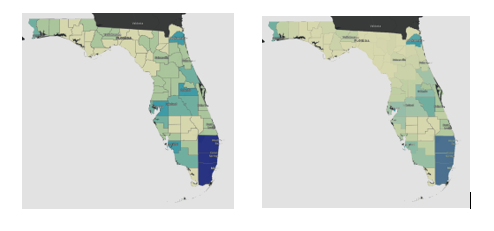
The map on the left is from the Florida DOH and shows cumulative cases. The map on the right shows what it might look like with only those still in need of care.