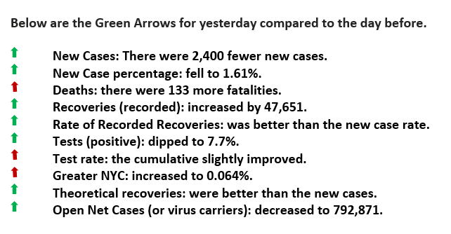
Yesterday was a SEVEN Green Arrow Day.
Weekly Summary for Week Ended July 19, 2020
Tests, Tests, and More Tests
Good Morning,
Yesterday was a SEVEN Green Arrow Day. Below are the particulars for the day.
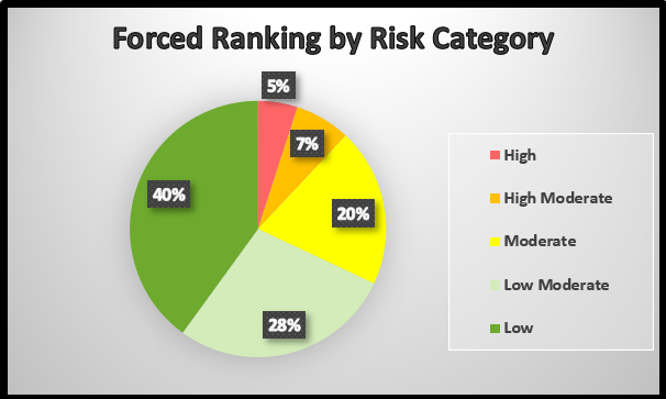
In a previous Newsletter (June 16, 2020), we discussed the concept of using a standard management tool know as Forced Ranking to better cope with COVID. The idea is to rank those underlying conditions that would put people at risk for the most severe reaction to the virus. This process reviews all of the fatalities until we derived the common denominators (excluding age) that would put a person at the highest risk. For example, those with obesity, diabetes, high blood pressure, et cetera appear to be in the more top risk categories. In other words, by identifying the most common combination of underlying conditions that put five percent of our population in the highest risk category, as shown in the diagram below, would give policymakers a better approach minimizing deaths.
One reader asked how we would propose to do that? We had to think about those questions for a bit, but we believe we have a workable solution. The challenge is that when we use general terms like obesity or diabetes, they probably aren’t specific enough to perform the “forced ranking.” However, prescription medicines are quite distinct. We could correlate those using drugs X, Y, and Z, because of what they treat, which would put those people in the highest risk category of red. We would continue that process to rank those in orange, yellow, and yellow-green. Let’s face it; the medications prescribed are designed to treat those underlying conditions.
Now imagine, based on the medications, a notice is sent from their doctor, hospital, or insurance company stating, “you are in the orange” risk category, or red, yellow, yellow-green or green. It wouldn’t take much programming and artificial intelligence to use prescriptions to force rank risk individuals and then categorize them accordingly. The medicines and those that use them are conveniently accessible databases.
The outcome is to create a more focused and productive way to protect those that need it the most.

Forced Ranking (FR)
This pie chart forces one to classify health conditions in risk categories. We know that 3.6% of those that contracted the virus died and their specific health conditions (i.e., age, weight, diabetic status, et cetera). What were those particular conditions? A process would ensue until the specific health traits would equal 5% of the US population, and then be identified as “high risk.” Then the next level (moderate risk), the one after that, and so on. Public reporting should match these risk groups. For example, there were 100 deaths yesterday, and all but one were in the high-risk or red category.

Please click here for references. If you have not already registered, register now to receive the latest updates on the unprecedented COVID-19 pandemic.

