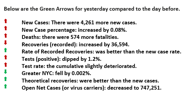
Yesterday was a FOUR Green Arrow Day.
Prescriptions are the Rx… Part 2
Yesterday was a FOUR Green Arrow Day. Below are the particulars for the day.
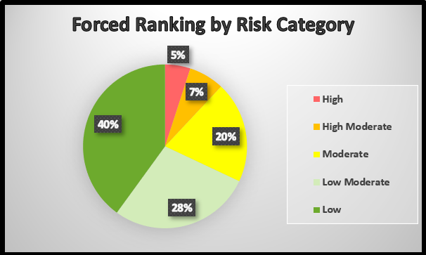
In the most recent newsletter, we detailed how an individual’s prescription drug use can provide us with substantial clues as to what risk category people would be categorized (see chart below). Today we are going to dig deeper into this approach.
The process would begin by analyzing the 145,000 fatalities and listing their prescription drug use. Those drugs were specifically prescribed based on their maladies and underlying conditions. Notice that age is not a factor in this analysis, at least not yet. Risk categories can then be established once the data has been tabulated. For instance, as 30% of the cases used a particular family of this drug or that, and another 25% used another family, we can begin to correlate what are the prime underlying conditions that put someone at high risk or the red category.
We hypothesize that to identify the 5% of the population that would fit into the red category; there would be common multiple underlying conditions. We might even stretch that hypothesis to say all might fit, but there are always anomalies. This would take a bit more computer analysis than our simple spreadsheets since there are at least 35 drugs prescribed for obesity. We don’t have the specific knowledge to distinguish the difference between these, but others do.
Once this “forced ranking” has been completed, then policymakers can recommend specific guidelines for each risk category. Indeed, those recommendations would be far more stringent for the red group compared to the green one.
The current strategy essentially assumes that we all have a universal risk and that a “one-size shoe” is the best answer. Not only would this strategy provide decision-makers with more focused information but also inform us individually what is specific risk profile may be. It also would let us know which one of those we care about are in a higher risk category.
In the end, isn’t that what we want to know? How much risk do I have personally and that of our loved ones? In this way, we can take the appropriate precautions.

Forced Ranking (FR)
This pie chart forces one to classify health conditions in risk categories. We know that 3.6% of those that contracted the virus died and their specific health conditions (i.e., weight, diabetic status, et cetera). What were those particular conditions? A process would ensue until the specific health traits would equal 5% of the US population, and then be identified as “high risk.” Then the next level (moderate risk), the one after that and so on. Public reporting should match these risk groups. For example, there were 100 deaths yesterday, and all but one were in the high-risk or red category.

Please click here for references. If you have not already registered, register now to receive the latest updates on the unprecedented COVID-19 pandemic.

