
Yesterday was a Eight Green Arrow Day.
Good Morning:
 The trends continue to show that the US is making progress in overcoming the spread of COVID 19. All categories improved from the prior day, except reported recoveries. But, like last week we may have a “Sunday” effect in which some activity wasn’t reported till Monday.
1. New case growth was 2.4% the second lowest day.
2. We had 5 consecutive days in which there were less deaths.
3. Greater NYC’s new cases dropped to 1.3% the lowest rate.
4. Net open cases are now less than 40%.
5. There we 34,354 more tests yet 2,396 less new cases.
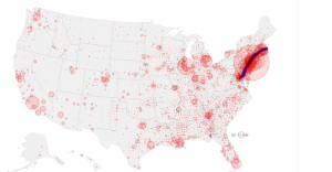
Most of us have seen a map similar to this one (see above), courtesy of CNN. The maps shows where there are or were COVID 19 cases, the accumulation of all cases. Notice the point; “where there were.” Although this type of map is good from a historical perspective, it may not be the best from a current policy making or public relations point of view.
What might be better is using a map that only shows Open Cases (see table). Based on our “Theoretical Recoveries” calculation there are 434,345 Open Cases. This map shows all cases, almost 1.2 million. Imagine seeing a map with only open cases, it would have two-thirds less red. That view would better highlight where to focus resources and restrictions. There most likely would be vast areas of any state in which the are just a few cases or none at all. All of the data we’ve seen points to a strong regional component to the virus.
Policy makers, in general, and particularly at the state level, seem to be using a “one size shoe fits all” strategy. The restrictions are being applied across an entire state rather than in intrastate regions. For example, in Michigan restrictions might need to be very stringent in greater Detroit whereas its Upper Peninsula they could be considerably relaxed, because there might only be a very few if any open cases.
BTW way this condensed version of this map certainly identifies our prime hot spot, the Boston to NYC corridor.
Have a great day.