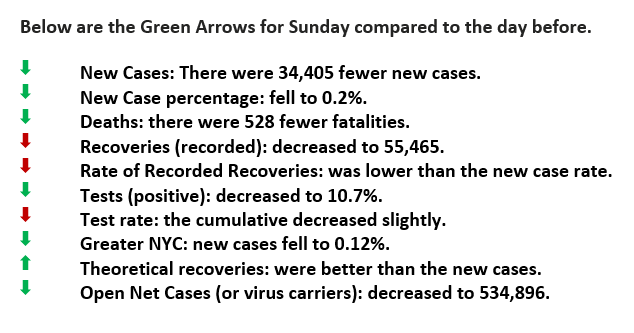
Sunday was a SEVEN Green Arrow Day.
January a Peak or Pause?
Good Morning,
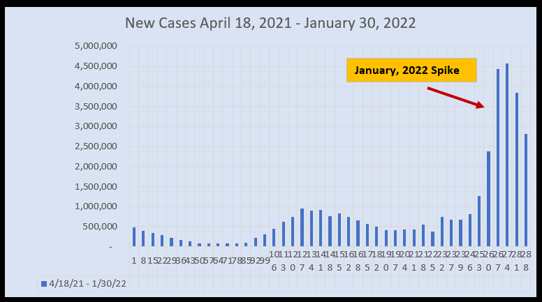
The “New Case” graph (below) shows the spike in new cases, perhaps it has peaked this January. There are three peaks in the graph. The first is the tail end of Covid 19 during the past mid-summer the second tally’s the Delta variant and the third Omicron.
We’d like to guess that the tale, diminishing new cases of Covid 19 was the cumulative effect of individuals becoming “fully vaccinated” and those acquiring immunity naturally. That would make sense and be quite logical. A similar pattern could be assumed for the Delta variant as people received their booster shots and again those reaching immunity via their own produced anti-bodies. Unfortunately, data isn’t being reported segregating new cases by Covid variant. Imagine having such information, which in essence would also demonstrate the effectiveness of vaccinations.
What impact would there be in knowing that the initial vaccinations were extraordinarily effective against Covid 19 and the booster the same for the Delta variant?
The third variant, Omicron, had more than double the infection rate of 4.4 million in one week as the original highest new case week of 1.7 million. The infection rate is over 18% compared to the historical average of just under 7%. Why is this one significantly more voracious than the others? We sure wish new cases eliminated any potential double counting, then we might have a better insight.


Please click here for references. If you have not already registered, register now to receive the latest updates on the unprecedented COVID-19 pandemic.

