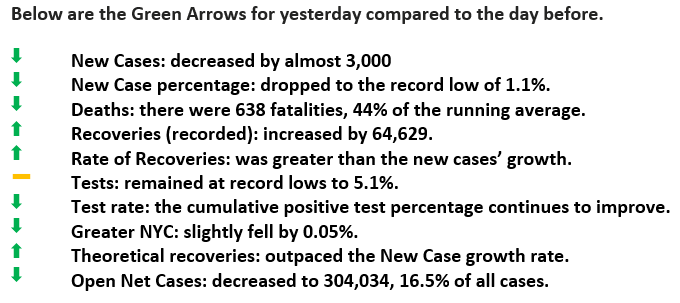
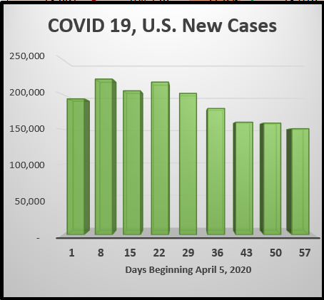
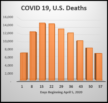
Yesterday was a NINE Green Arrow Day.
Weekly Summary
Good Morning,
For the week ended May 31, 2020, the three categories we graph continued with favorable trends.
We look at “New Case Rates,” Fatalities, and “Test Results.” These necessarily answer the questions: are we getting better, are fewer people dying and are there more with negative test results than before.
The latter category is maybe the most essential to monitor, as there are fewer and fewer positive tests. That’s perhaps is the best sing of progress. Below are the graphs and related observations.
New Case Rate:
In late March, recorded infection rates were in the mid-twenty percentages. Since then, it has fallen to below the 2% threshold and has been below it for 23 straight days. There has been a 32% drop since the week ending April 12th.
Death Rates:
The category with the highest level of improvement is fatalities. There were 53% less than the week ending April 19th. On average, it was the first week that deaths were less than 1,000/day (985). Later this week, we will provide more in-depth insight into these statistics.
Negative Test Rates:
Tests also showed improvement falling from the high of 19.9% early on to 5.2% last week. A couple of points are needed to provide understanding beneath the data. First, for the most part, only people that are symptomatic get a test, otherwise why bother. This factor tends to create a bias toward a higher level of a positive test. Recently, however, hospitals have begun to perform elective procedures, and protocol requires a COVID 19 test, which will dampen the bias a bit because only relatively healthy people have elective surgery.